|
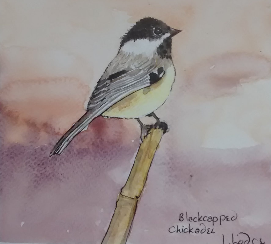
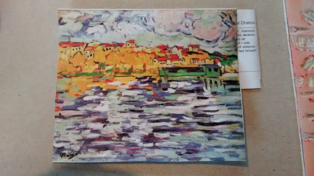
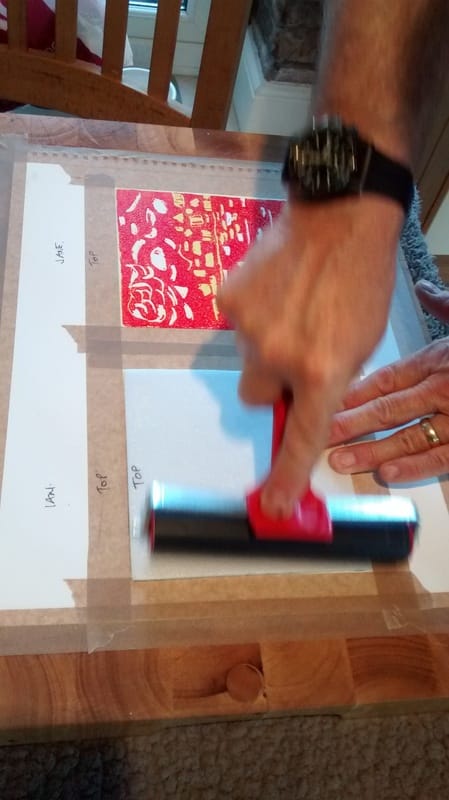
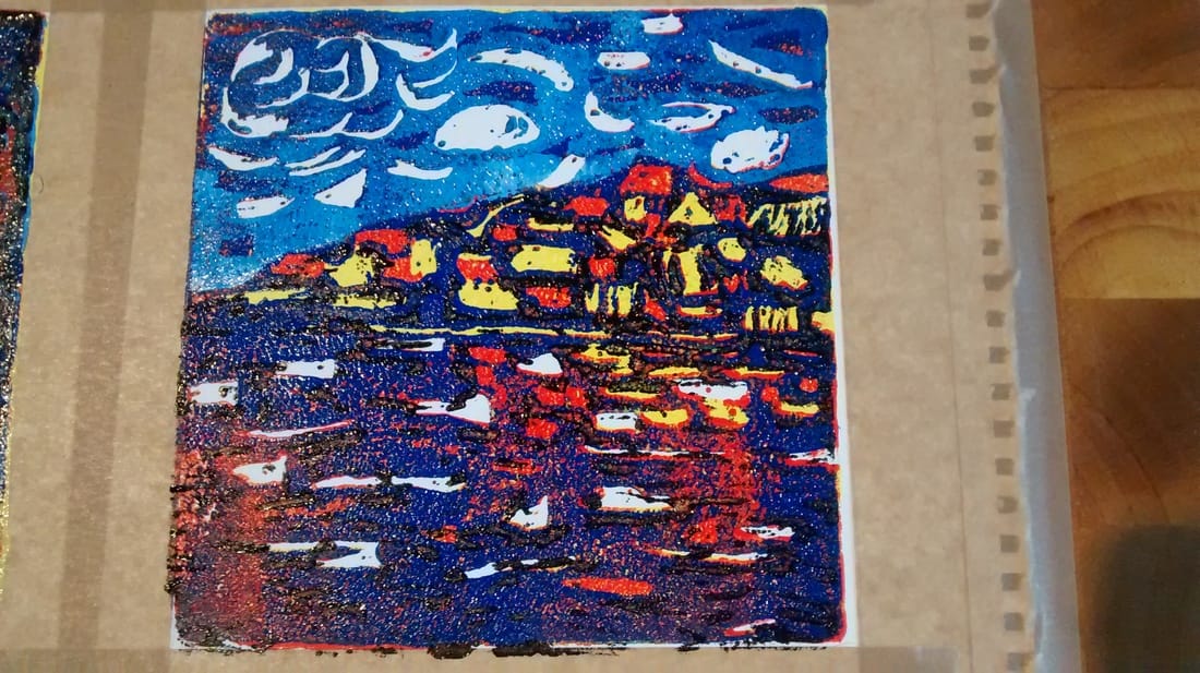
Another process that is really fun; thanks again to Ian who shared his expertise. So the process for this is as follows. 1. You will need - a tile of polystyrene cut to the size you want your print to be. We used 15cm squares which are relatively easy to manage and quick to complete. You can get tiles for £0.99 at Homecraft and many other stores. These can make 4 of the size we used. - a few basic colours of water-based printing inks. Being water-based makes it easy to wash off. - things to make marks with - you could use a range of objects but a simple sharp pencil is as useful as anything else and that's what we used. - two rollers, one wide one for pressing the tile onto the print and one narrow one for applying the ink to the tile. - a piece of persex to put the ink into so that you can roll it out and onto the roller. - prepared paper to print on. We used watercolour paper with the 15cm square drawn onto it and the word'TOP' written above the top. Ian explained that if you then also write the word , 'top' onto the top of the tile at the back, you will always align the print and tile correctly when printing. You will also need an idea or source material to help you plan. My print design was based on a painting by Vlaminck called, Houses on the Banks of the Seine at Chatou and Ian's on an abstract painting by Jorn Asger, called, 'Dead Drunk Danes' - now there's a title. Now to describe the layers approach - the reason why it's called 'Reduction Printing' 1.Very important to first decide what four colours you will use (with white making the fifth) going from light to dark. I went for yellow, red, blue and black (the light blue happened later - I didn't start off by planning it) 2. Decide what you want to leave white - and then dig marks into the tile where the white will be. So far, so good. Then prep a small amount of the first colour (yellow for me) on the piece of perspex and with the smaller roller cover the tile with ink. Lift the tile carefully at the edges, align the top with the top of the 15cm taped off square on the watercolour paper and press the ink side down carefully. Use the wider roller to press the tile onto the paper, making sure to keep the tile still. Wash the perspex, the tile and the roller ready for the next colour. 3. So, you now have a print on the paper all in yellow with some areas left white. Then you decide which bits of your design or picture will stay yellow and dig out the shapes with your pencil. Always take care not to go all the way through the tile as this will weaken it. 4. Once you have marked out where the yellow will stay, prep your next colour, (in my case, red) and do exactly the same as before, prepping the ink onto the roller, applying carefully to the tile and then printing it with the help of the wider roller. You now have a print all in read with some yellow bits and some white areas. 5. Ian now explained how to allow one colour to 'shimmer' through the next layer which is great for water or a sky effect. Basically you decide which bits you want to leave red (same process as before) and mark those areas and then, when you ink the tile again, with the next colour (blue for me) do it thinly so that when you print onto the red print, the darker colour allows the red to come through in a shimmer effect. (see my water which has red shimmering through the blue). 6. Now a change of plan on my print. I wanted the sky to look different to the water, so Ian suggested mixing a paler blue, cutting the tile where the sky meets the sea and doing the last print in two parts, so I did. I printed a lighter blue for the sky, having marked out those bits I wanted to leave darker blue. I then inked the lower part of the tile with black after digging out almost the whole area because I only weanted a touch of black to deepen the image. So that last part took the longest to prep the tile otherwise I would have had too much black on the finished print. Thank you Ian, this was great fun and I will definitely take this further. If you would like to have ago at this, Ian is offering a week of tutored support at ARTLIMOUSIN in 2017. Look at the dates page for more details. Email me if you would like to know more. I have to say he is brilliant at supporting you through the process.
0 Comments
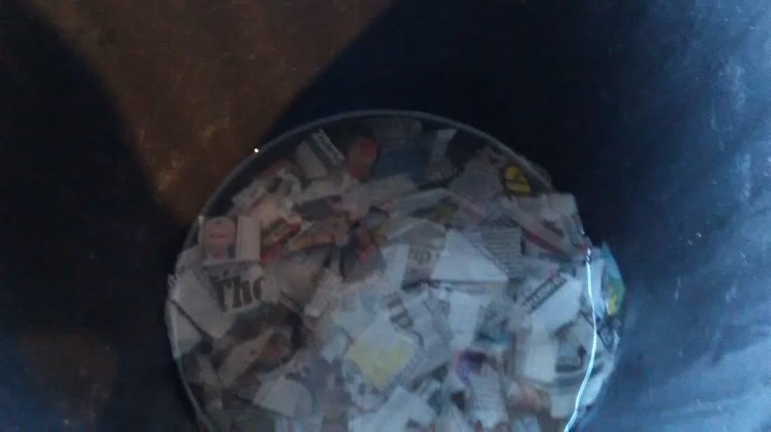
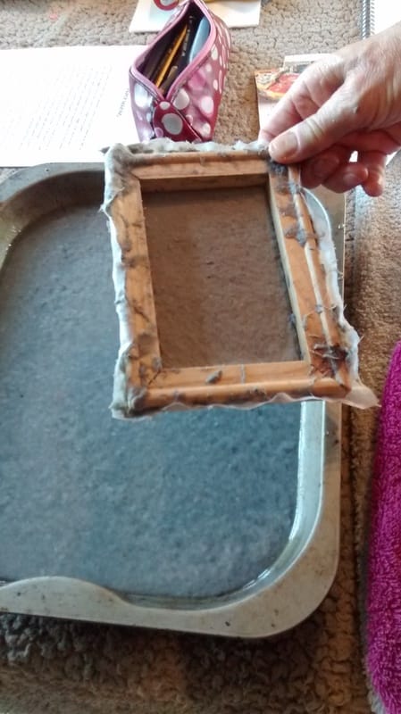
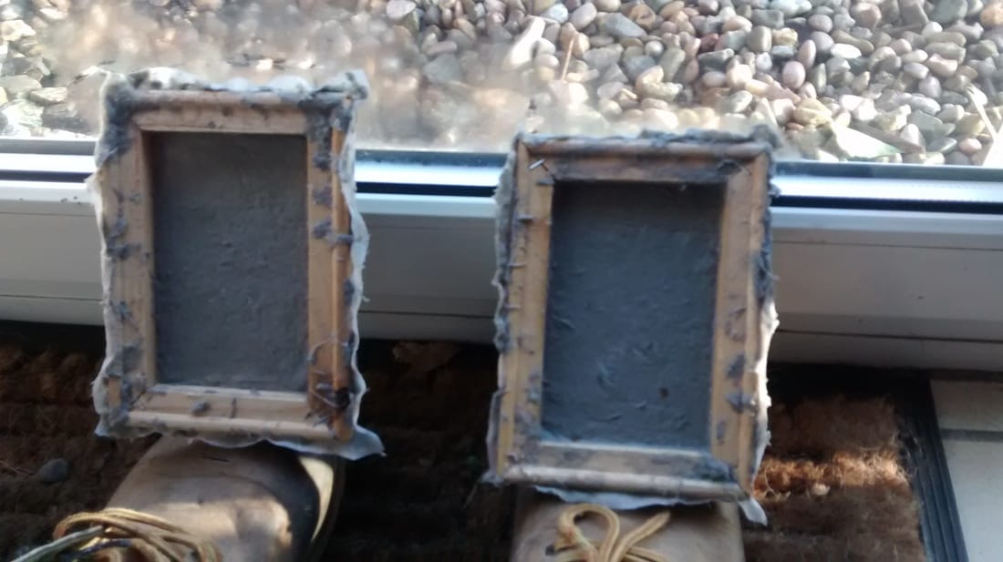
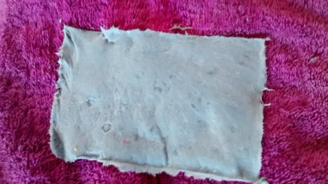
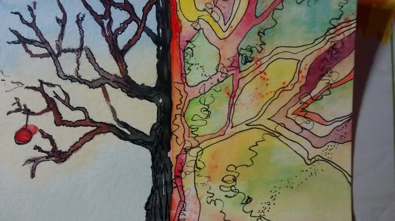
.Yesterday I had a go at making my own paper, following the process with one of Artlimousin's tutors, Ian. It was good fun and clearly has lots of potential for different kinds of paper that you could then write and or draw/ paint on. So this is the process. You will need: - any different kinds of soft paper (glossy magazine paper won't work) - newsprint is easily acquired - you can buy unused newsprint quality paper cheap at Staples, Boyes or similar (Staples sells 50 sheets for £5.99) -or you can rip up old newspapers but be aware the ink will tint the paper. You can use tissue paper but you don't want too much of this as it is very soft - some gauze - again v cheap by the metre at Boyes, for example. - a frame to stretch the gauze across. Ian achieves this by buying the prepared canvasses in the Works and cutting out the canvas - a wall stapler to attached the gauze to the frame with - a bucket to soak paper in - something to help you mush the soaked paper, e.g. blender etc. I use a hand held soup blender as I already have one to hand - a deep tray that is deeper and bigger than the screen you are using - a roasting tin does the job for the small frame we used. - old towels and some J Cloths So - 1. Stretch some gauze over your frame. Keep the tension firm and staple both sides in the middle of opposite sides first maintaining tension. Then work rest as opposites, keeping tension throughout. The bigger the screen you use, the bigger your peice of paper will be. 2. Rip up paper, fairly small, and soak in plenty of water in the bucket for at least one hour. You can add food colouring to tint the paper or add a touch of white vinegar to create a whiter result 3. When well soaked use blender to much the paper completely - add warm water to the paper that you have scooped out of the bucket so that you have about half water to paper. You want a smooth pulp with no flakes of paper left 4. Fill the tray (e.g. roasting tin) with water and add some pulp. The more pulp, the thicker the paper so not too much. (Handy tip - if you add liquid starch at this point, the resulting paper will be better to write or paint on as it won't absorb so much of the ink or paint and you will get a clearer line or image. 5.Place frame in the tray with the pulp and water and allow some of the mixture into the frame. Move it backwards and forwards gently until you have an even spread of pulp. At this point you can add fun stuff, wool, bits of coloured tissue, sequins, cruched up autumn leaves etc to add interest. Experiment. 6. Slowly bring the frame out of the tray and continue to gently let pulp settle and water drain off. Put the frame with the pulp in it carefully onto an old towel and use a J cloth (folded into neat layers, not scrunched up) to dab an evan pressure on the paper to remove some of the moisture 7. When the paper is beginning to dry, carefully ease the edge away from the frame in one corner, get knife blade under paper and gently lift off - be paptient here - paper will still be fairly wet and you dont want to scrunch it up) 8. Finally, leave it to dry on a towel or speed dry with hairdryer and enjoy. As mentioned before, I am very interested in glazing with oils, originally from studying old paintings like vermeer and I have a plan to learn how to achieve something similar in the new year, may even be my New Year's Resolution - we'll see. Anyway, I cam across a good glazing guide in Artists and Illustrators, one of my favourite art magazines, how advertised Artlimousin last year for me. The web address below is well worth a visit. I love the idea that a transparent galze affects the way we see the original colour of a painting. I read a book about an art forgery where the original painter was Degas and apparently he used loads of layers to achieve the colours in his work. Daily life. I am using Linseed oil to make beautiful a toybox for our newest grandson - see picture. Also, I have entered the SAA postcard competition - get those entries in if you want to enter as it closes at end of December. Its a simple but great idea. You paint half and ask a painting partner to paint the other half. I have done one with Paul and one with Lynn, thank you to them both - great fun. If you want a go visit community.saa.co.uk and search for postcard partners. Christmas is coming. Time seems elastic and yet each day disappears into the ether before I have completed, or, let's be honest, started, to action my grand plans for the day. I have been enjoying the winter skies and the colours when sun is followed by threatening rainclouds and the whole imbued with a sort of internal light. Although summer is wonderful there is something special about winter light. So, today's 10 minute challenge follows a conversation when out for coffee at Burton Agnes where the sky was really interesting. We talked about using watercolour and exaggerating colour. I tried wet in wet because of the time factor and quite like the effect. 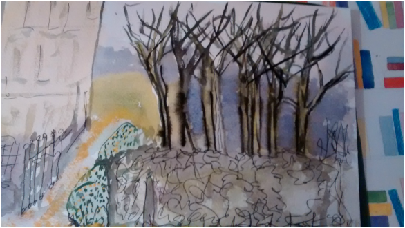 |
Jane Limousin
|


 RSS Feed