|
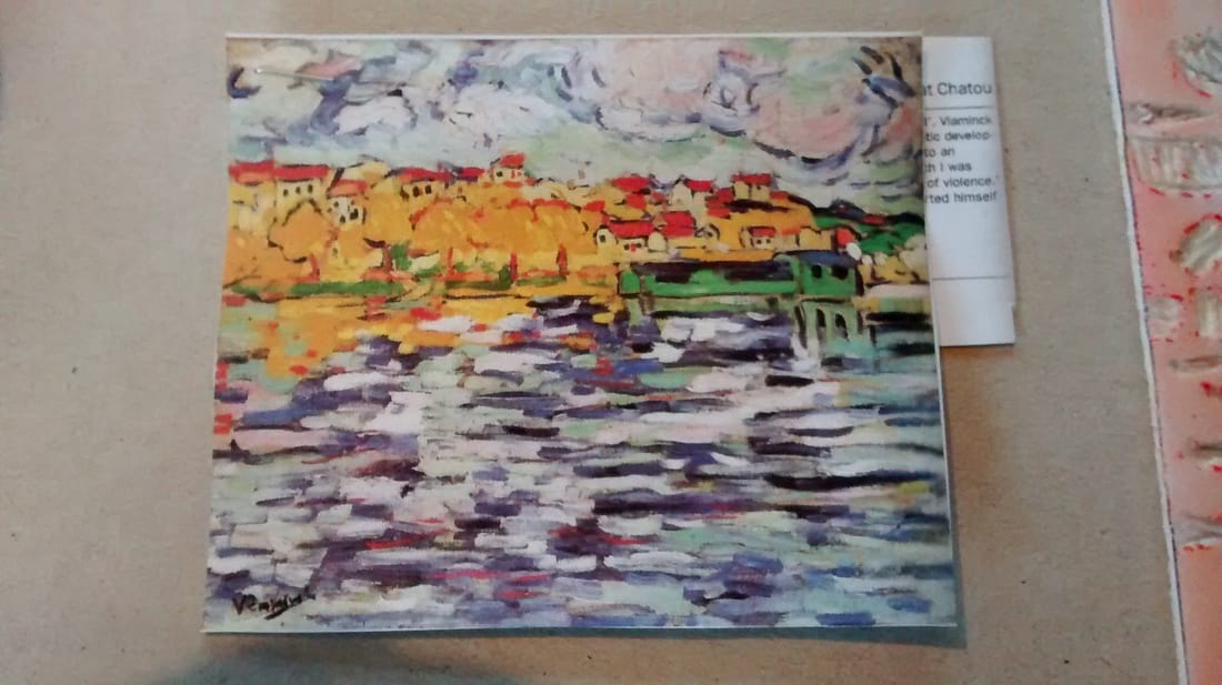
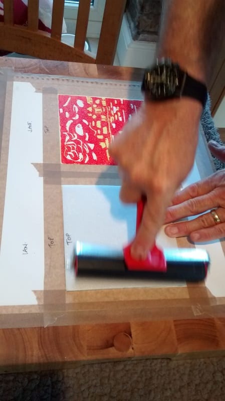
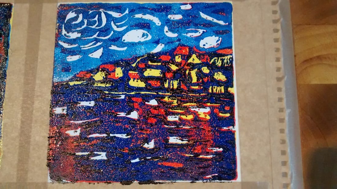
Another process that is really fun; thanks again to Ian who shared his expertise. So the process for this is as follows. 1. You will need - a tile of polystyrene cut to the size you want your print to be. We used 15cm squares which are relatively easy to manage and quick to complete. You can get tiles for £0.99 at Homecraft and many other stores. These can make 4 of the size we used. - a few basic colours of water-based printing inks. Being water-based makes it easy to wash off. - things to make marks with - you could use a range of objects but a simple sharp pencil is as useful as anything else and that's what we used. - two rollers, one wide one for pressing the tile onto the print and one narrow one for applying the ink to the tile. - a piece of persex to put the ink into so that you can roll it out and onto the roller. - prepared paper to print on. We used watercolour paper with the 15cm square drawn onto it and the word'TOP' written above the top. Ian explained that if you then also write the word , 'top' onto the top of the tile at the back, you will always align the print and tile correctly when printing. You will also need an idea or source material to help you plan. My print design was based on a painting by Vlaminck called, Houses on the Banks of the Seine at Chatou and Ian's on an abstract painting by Jorn Asger, called, 'Dead Drunk Danes' - now there's a title. Now to describe the layers approach - the reason why it's called 'Reduction Printing' 1.Very important to first decide what four colours you will use (with white making the fifth) going from light to dark. I went for yellow, red, blue and black (the light blue happened later - I didn't start off by planning it) 2. Decide what you want to leave white - and then dig marks into the tile where the white will be. So far, so good. Then prep a small amount of the first colour (yellow for me) on the piece of perspex and with the smaller roller cover the tile with ink. Lift the tile carefully at the edges, align the top with the top of the 15cm taped off square on the watercolour paper and press the ink side down carefully. Use the wider roller to press the tile onto the paper, making sure to keep the tile still. Wash the perspex, the tile and the roller ready for the next colour. 3. So, you now have a print on the paper all in yellow with some areas left white. Then you decide which bits of your design or picture will stay yellow and dig out the shapes with your pencil. Always take care not to go all the way through the tile as this will weaken it. 4. Once you have marked out where the yellow will stay, prep your next colour, (in my case, red) and do exactly the same as before, prepping the ink onto the roller, applying carefully to the tile and then printing it with the help of the wider roller. You now have a print all in read with some yellow bits and some white areas. 5. Ian now explained how to allow one colour to 'shimmer' through the next layer which is great for water or a sky effect. Basically you decide which bits you want to leave red (same process as before) and mark those areas and then, when you ink the tile again, with the next colour (blue for me) do it thinly so that when you print onto the red print, the darker colour allows the red to come through in a shimmer effect. (see my water which has red shimmering through the blue). 6. Now a change of plan on my print. I wanted the sky to look different to the water, so Ian suggested mixing a paler blue, cutting the tile where the sky meets the sea and doing the last print in two parts, so I did. I printed a lighter blue for the sky, having marked out those bits I wanted to leave darker blue. I then inked the lower part of the tile with black after digging out almost the whole area because I only weanted a touch of black to deepen the image. So that last part took the longest to prep the tile otherwise I would have had too much black on the finished print. Thank you Ian, this was great fun and I will definitely take this further. If you would like to have ago at this, Ian is offering a week of tutored support at ARTLIMOUSIN in 2017. Look at the dates page for more details. Email me if you would like to know more. I have to say he is brilliant at supporting you through the process.
0 Comments
Leave a Reply. |
Jane Limousin
|
 RSS Feed